Spring & Summer 2026 Color Trends
Every season, the Pantone Color Institute unveils its forecast of hues that will dominate fashion, design, and lifestyle trends.
This season’s report features the top 10 standout colors, as well as the five new seasonless shades we can expect to see as fashion designers introduce their new Spring / Summer 2025 collections.
You will see these colors being incorporated into my upcoming designs.
This palette moves away from uniformity, encouraging personal expression, mixing bold, uplifting brights with softer pastels and strong neutrals, balancing familiar comfort with new discoveries for an authentic sense of style
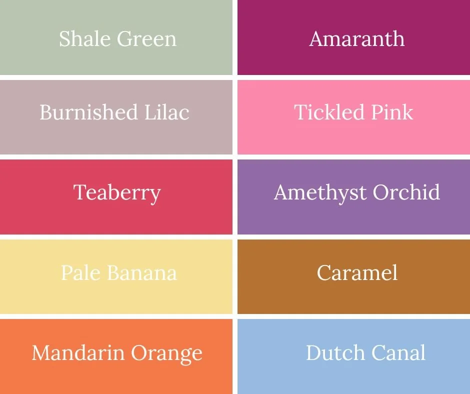
Amaranth
Amaranth is a color I’m endlessly drawn to for its richness and quiet drama. Deep and velvety, with hints of wine and berry, it brings a sense of depth and sophistication to my designs. I love how Amaranth enhances the warmth of metals and adds intensity to stones and crystals, creating pieces that feel confident and expressive without being overstated. It’s a timeless, soulful color—bold yet elegant—perfect for jewelry that feels meaningful, personal, and enduring.
Tickled Pink
Tickled Pink is a color that always brings a sense of delight to my designs. Soft, cheerful, and lightly playful, it has a warmth that feels personal and inviting. I love how Tickled Pink brightens pearls, crystals, and delicate metals, adding a touch of joy without overwhelming the piece. It’s a color full of charm and whimsy—feminine, fun, and effortlessly wearable—perfect for jewelry that’s meant to make you smile every time you wear it.
Amethyst Orchid
Amethyst Orchid is a color I love for its mysterious, enchanting beauty. Rich and slightly muted, it combines the depth of amethyst with the softness of orchid, creating a hue that feels both sophisticated and playful. I enjoy how Amethyst Orchid brings out the sparkle in crystals and the warmth of metals, adding a subtle drama to each piece. It’s a color that feels elegant, expressive, and a little magical—perfect for jewelry that’s meant to be noticed, cherished, and treasured.
Caramel
Caramel is a color I adore for its warm, comforting richness. Smooth and golden, it brings a cozy, inviting glow to my designs, enhancing the natural beauty of pearls, stones, and metals. I love how Caramel feels timeless and versatile—soft enough for everyday wear, yet deep enough to add elegance and depth. It’s a color that feels nurturing, classic, and effortlessly beautiful—perfect for jewelry meant to be worn, loved, and treasured.
Dutch Canal
Dutch Canal is a color that captures my imagination with its cool, serene depth. Inspired by the calm waters and historic charm of European canals, it brings a sense of tranquility and sophistication to my designs. I love how Dutch Canal pairs beautifully with both warm and cool metals, as well as stones and crystals, creating pieces that feel elegant, timeless, and quietly expressive. It’s a color full of character—calm, refined, and perfect for jewelry that feels thoughtfully crafted and cherished.
Shale Green
Shale Green is a softly grounded, nature-inspired hue that speaks to my love of subtle color and natural beauty. Reminiscent of weathered stone and quiet landscapes, it brings a sense of balance and calm to my designs. I’m drawn to how Shale Green pairs effortlessly with pearls, semi-precious stones, and warm metals, allowing each element to shine without overpowering the whole. It’s a color I return to again and again—timeless, versatile, and perfectly suited to jewelry made to be worn, loved, and treasured.
Burnished Lilac
Burnished Lilac is a color I adore for its quiet romance and depth. Softly muted with a gentle warmth, it feels both nostalgic and modern at the same time. I love how it adds a subtle glow to my designs, bringing out the natural beauty of pearls, crystals, and semi-precious stones without ever feeling overpowering. Burnished Lilac has a reflective, almost poetic quality—elegant, calming, and a little unexpected—making it perfect for pieces that are meant to feel personal, expressive, and truly special.
Teaberry
Teaberry is a color that brings warmth, richness, and a touch of bold confidence to my designs. Deep and inviting, it sits somewhere between berry and wine, adding depth without feeling heavy. I love how Teaberry energizes a piece—highlighting the glow of metals and intensifying the character of stones and crystals. It’s a color with personality: expressive, feminine, and quietly powerful, perfect for jewelry that makes a statement while still feeling timeless and wearable.
Pale Banana
Pale Banana is a color that makes me smile every time I work with it. Soft, creamy, and gently sunlit, it brings a lightness and sense of optimism to my designs. I love how this subtle yellow lifts other colors, adding warmth without overpowering, and how beautifully it complements pearls, crystals, and soft metallic tones. Pale Banana feels fresh, joyful, and quietly cheerful—perfect for pieces that capture a little everyday brightness and effortless charm.
Mandarin Orange
Mandarin Orange is a color I turn to when I want to capture energy, warmth, and joyful confidence. Bright yet refined, it brings a lively spark to my designs without feeling overpowering. I love how Mandarin Orange plays against golds and coppers and adds vibrancy to stones and crystals, instantly lifting a piece. It’s a color full of warmth and creativity—bold, expressive, and perfect for jewelry that feels spirited, playful, and impossible to ignore.
Amaranth
Amaranth is a color I’m endlessly drawn to for its richness and quiet drama. Deep and velvety, with hints of wine and berry, it brings a sense of depth and sophistication to my designs. I love how Amaranth enhances the warmth of metals and adds intensity to stones and crystals, creating pieces that feel confident and expressive without being overstated. It’s a timeless, soulful color—bold yet elegant—perfect for jewelry that feels meaningful, personal, and enduring.
Tickled Pink
Tickled Pink is a color that always brings a sense of delight to my designs. Soft, cheerful, and lightly playful, it has a warmth that feels personal and inviting. I love how Tickled Pink brightens pearls, crystals, and delicate metals, adding a touch of joy without overwhelming the piece. It’s a color full of charm and whimsy—feminine, fun, and effortlessly wearable—perfect for jewelry that’s meant to make you smile every time you wear it.
Amethyst Orchid
Amethyst Orchid is a color I love for its mysterious, enchanting beauty. Rich and slightly muted, it combines the depth of amethyst with the softness of orchid, creating a hue that feels both sophisticated and playful. I enjoy how Amethyst Orchid brings out the sparkle in crystals and the warmth of metals, adding a subtle drama to each piece. It’s a color that feels elegant, expressive, and a little magical—perfect for jewelry that’s meant to be noticed, cherished, and treasured.
Caramel
Caramel is a color I adore for its warm, comforting richness. Smooth and golden, it brings a cozy, inviting glow to my designs, enhancing the natural beauty of pearls, stones, and metals. I love how Caramel feels timeless and versatile—soft enough for everyday wear, yet deep enough to add elegance and depth. It’s a color that feels nurturing, classic, and effortlessly beautiful—perfect for jewelry meant to be worn, loved, and treasured.
Dutch Canal
Dutch Canal is a color that captures my imagination with its cool, serene depth. Inspired by the calm waters and historic charm of European canals, it brings a sense of tranquility and sophistication to my designs. I love how Dutch Canal pairs beautifully with both warm and cool metals, as well as stones and crystals, creating pieces that feel elegant, timeless, and quietly expressive. It’s a color full of character—calm, refined, and perfect for jewelry that feels thoughtfully crafted and cherished.