Fall & Winter 2025 Color Trends
Every season, the Pantone Color Institute unveils its forecast of hues that will dominate fashion, design, and lifestyle trends—and the Fall/Winter 2025/26 palette is nothing short of captivating. This year’s selection reflects a world in transition: a yearning for warmth and comfort, balanced with a bold embrace of individuality and self-expression. From indulgent reds and grounding browns to poetic pinks, vintage-inspired purples, and serene blues, the forecast captures both the quiet elegance of timeless classics and the unexpected spark of modern creativity. It’s a palette designed not only to adorn but to evoke emotion, stir imagination, and invite personal storytelling through color. Whether you’re a designer, artist, stylist, or simply a lover of beautiful things, Pantone’s vision for the season offers a roadmap to infuse everyday life with richer tones and deeper meaning.
The Pantone Color Forecast for Fall/Winter 2025/26 is more than just a seasonal palette—it’s a reflection of our collective mood and imagination. From the grounding comfort of Hot Chocolate and Bronze Brown to the striking intensity of Winterberry, Chili Oil, and Poppy Red, the season embraces both warmth and bold expression. Softer tones like Primrose Pink and Lemon Grass bring lightness and renewal, while rich, dramatic shades such as Lyons Blue and Damson evoke timeless elegance. This balance of vibrancy and subtlety encourages us to mix, layer, and experiment, creating looks and designs that are deeply personal yet universally resonant. Whether applied to fashion, jewelry, interiors, or creative projects, the Fall/Winter 2025/26 Pantone palette invites us to embrace color as a powerful form of storytelling—one that grounds us in tradition while inspiring us to dream boldly forward.
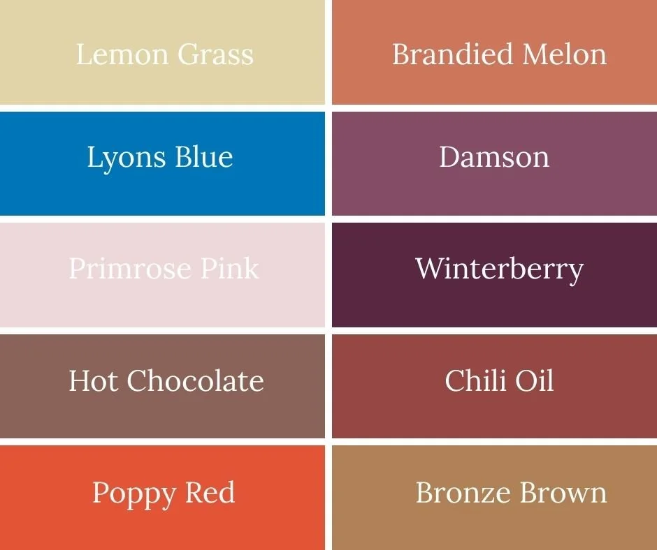
Lyons Blue
Lyons Blue is a deep teal that channels vintage luxury and timeless sophistication. With its rich undertones, this hue feels grounded yet dramatic, perfect for statement coats, elegant accessories, or striking home accents. Lyons Blue bridges the gap between classic navy and jewel-like green, making it endlessly versatile for both bold fashion statements and subtle design details.
Damson
Damson is a luscious purple that carries the richness of ripe fruit and the depth of vintage glamour. Bold and expressive, this shade offers a dramatic alternative to traditional reds or browns for autumn. Whether used in plush fabrics, jewel-toned accessories, or artistic accents, Damson adds a touch of mystique and romance to the season’s palette.
Primrose Pink
Primrose Pink is delicate yet enlightening—a whisper of softness amid fall’s darker hues. It brings lightness and femininity to the palette, offering balance to more robust tones like Chili Oil or Bronze Brown. In fashion, it works beautifully for layering or accessories, while in interiors it adds a gentle lift to neutral spaces. Primrose Pink proves that pastels are no longer just for spring.
Hot Chocolate
Hot Chocolate wraps the season in comfort with its rich, cocoa-inspired warmth. This deep brown feels luxurious and grounding, the perfect neutral to anchor brighter hues. It evokes the indulgence of a cozy winter evening while still remaining sophisticated enough for polished styling. Whether in textured fabrics, accessories, or interiors, Hot Chocolate delivers depth and calm.
Chili Oil
Chili Oil is a bold, vital red-brown that radiates energy and dynamism. Spicy and striking, it infuses the palette with vibrancy and confidence, making it a natural choice for statement pieces and accents. Paired with soft pinks, it feels daringly modern; set against browns and neutrals, it conveys classic warmth. Chili Oil is the season’s call to turn up the heat.
Poppy Red
Poppy Red bursts into the Fall/Winter 2025/26 palette with unapologetic vibrancy and passion. This bold, energetic red captures the eye instantly, radiating confidence and vitality in every setting. Unlike deeper, moodier reds of the season, Poppy Red feels spirited and youthful—perfect for making a statement in outerwear, accessories, or even interior accents. When paired with neutrals like Vapor Blue or French Roast, it takes on a sophisticated edge, while alongside Lemon Grass or Primrose Pink it exudes playful modernity. Poppy Red is a reminder that even in the darkest months, color can be fearless and full of life.
Bronze Brown
Bronze Brown glows with an understated elegance, its lustrous golden undertone adding richness to a classic brown. It suggests heritage and natural beauty, yet feels contemporary when paired with modern hues like Lyons Blue or Primrose Pink. Bronze Brown is versatile—earthy enough to ground a look, yet radiant enough to shine on its own.
Lemon Grass
Lemon Grass is a lemon-infused green with a soft floral undertone, offering a refreshing brightness in an otherwise moody seasonal palette. Its gentle energy pairs beautifully with earthy neutrals for a natural feel, or it can be used as a lively accent to offset richer tones like Winterberry or Hot Chocolate. Playful yet poised, Lemon Grass reminds us that even in the colder months, color can feel light and renewing.
Brandied Melon
Brandied Melon introduces a muted orange touched with spice, creating a cozy warmth that feels nostalgic and inviting. This shade embodies autumn’s comforting side—think harvest tones and glowing sunsets—but with a modern twist that makes it versatile beyond seasonal clichés. Perfect for layering into fashion or interiors, Brandied Melon adds a subtle, sunlit glow that complements both soft pastels and bold jewel tones.
Winterberry
Winterberry is a sultry, engaging red that stirs the senses and demands attention. It’s bold without being brash, evoking festive warmth and timeless elegance. Perfect for statement pieces—from outerwear to eveningwear—it also shines when used sparingly, adding passion and intensity to a more neutral backdrop. Winterberry is the color of confidence, celebration, and seasonal allure.